
You're going to love this app.
Not only is it easy to use, it's a heck of a lot of fun. And the fact that it will dramatically increase student engagement in your classroom makes it almost indispensible.
When used during lessons and discussions, the Class Cards app will enable you to:
- Use a randomly generated list of students from a class as an aid for determining which student to call upon.
- Select a student of your choosing to be the one to respond.
- Quickly rate the quality of each student's response.
- View response scores by individual student or an entire class.
- Email yourself scores for all classes or a selected class.
- Archive scores to a secure website where you can view class info, print grade sheets, or download the data for importing into an Excel spreadsheet.
For a bit of background on the app, click here.
![]()
For a more detailed look at the app, I've created a fully-illustrated, mobile-friendly Class Cards App User Guide. It's designed to be viewed on your iPhone, iPod Touch, iPad, or Android device. (You can view it on your computer browser if you wish but it's kinda tall and skinny.)
![]()
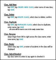
If you already have the Apple version, click on the image below to download the new quick reference sheet.
![]()
Click on the first image to go directly to preview pages for the Apple iTunes App Store or Google Play.


![]()
APP UPDATES

Added a requested feature that actually doubles as another feature.
#1 Import a Class List
Since the app's release in September, 2010, the only way to enter the names of students was to use the on-screen keyboard. Version 1.5 fixes that by allowing you to create a .txt file that contains the name of the class and a list of students to place in the class.
For complete step-by-step instructions, take a look at the How to Import a Class List section of user guide.
#2 Share Class Data with Another Device
Now that you can import a class list, you'll be able to import class data from one device to another. All you have to do is tap the Email Scores button on one device and then open the email in the other one. The second device will import everything: the name of the class, the names of the students, and their scores.

Cleaned up a few things and added two new features.
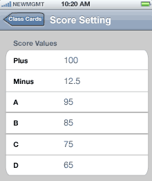
#1 Adjustable Score Values
Since not every teacher uses the same scoring system, I thought it made sense to allow each user to determine the values for each of the six score buttons.
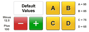
You can make your own changes in the settings screen which is located in the general settings screen.
#2 Return Students to Queue
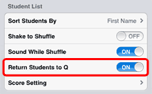
The app is designed to remove students from the random queue after they've been called upon. You'll know when you're coming to the end of the queue because you'll see text boxes begining to empty. After the last student has been called upon, a quick shuffle will randomize the names and refill the boxes.
If you'd prefer to have students returned to the end of queue after they've been called upon--which means the queue won't empty--just activate the Return Students to Queue feature in the settings screen.

Fixed an iOS 5 compatibility issue that was causing the app to crash on launch.

Added two simple yet powerful features.
#1 Select a Student
In addition to seeing a randomly generated list of students, you'll now have the ability to select a student to call upon by tapping the Select button and then tapping the name of the student from the class roster that appears.
This new feature opens all kinds of doors. More than just a random name generator, the app can now be used to track assignments or even document inappropriate behavior.
For instance...
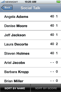
Imagine duplicating a class list and calling it Social Talk. The Select button would allow you to assign a D to anyone talking socially.
At the end of class, a quick sorting of the scores from high to low would display the talkers at the top of the list since they'd be the only ones with an assigned grade. And with the talkers identified, you'd know which students to call aside and which ones to leave alone.
#2 Email Scores
The ClassCardsApp.com server is a great place to keep student information safe. I get the feeling, though, that some users aren't taking advantage of this free service. It might be a hesitancy to trust the security of the server or maybe it's just too much trouble.
Whatever the reason, the app now allows you to send yourself an email that contains the score information for each class in your app. Simple, yet effective.
Maybe this is the way I should have gone in the first place. If so, better late than never.
Note: The score info is sent to you as comma-separated data. You'll also receive a text file attachment for each class which you can import into Excel.
For more information, check out the mobile-friendly user guide. ClassCardsApp.com/Mobile

Having lived with the app since its release at the end of September, I'd come to the realization that there were a few things with which I wasn't happy and wanted to change. Additionally, there were a couple of features that produced some unintended consequences which needed to be addressed.
But, then, that's just how it goes with ideas. You have to live with them for a bit before you're able to see what works and what doesn't.
With that in mind, here are five upgrades to the app--and one for the ClassCardsApp.com server--that will make the app more functional and a bit easier to use.
#1 Select a Student
Since students don't always have the same amount of response opportunities, their scores (the total number of points earned as shown in the first column, left screen) proved to be less than helpful at providing a quick assessment of the overall quality of each student's participation.
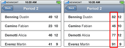
However, when participation is displayed as a percentage--as seen inside the red rectangle--the results are much clearer.
Martin's effort at responding, for instance, really stands out. And it would probably be a good idea to have a chat with Fabian, eh?
#2 Double-Tap Title Bar to Shuffle Names
The "Shake to Shuffle" feature--which can be turned on or off in the settings screen--is a lot of fun. Sadly, though, I was hearing from teachers who were inadvertently triggering a shuffle by merely gesturing with the iPhone/iTouch during a lesson.
And although you could turn off the feature in the settings screen, shuffling the names then required that you:
- Tap the BACK button.
- Select the class again.
- Tap the DEAL button.
Not all that onerous in the overall context of life; nonetheless, it was not as simple as it should have been.
The update offers the ability to shuffle the names by merely double-tapping on the "Class Cards" title in the Deal screen.
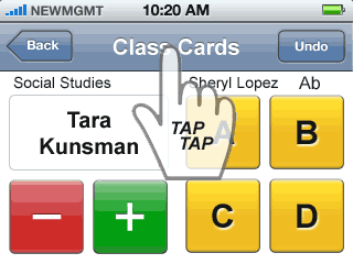
FYI: The "Sound on Shuffle" feature will still work if it's turned on.
#3 Absence Clearing
Marking a student absent is easy.
Select a class and then tap the Edit button. Scroll to the absent student's name and tap it. You'll be shown an edit screen with two buttons in the lower portion of the screen.
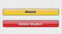
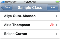
Tap the Absent button and you'll be returned to the Edit screen. Next to the absent student's name will be a red Ab indicator.
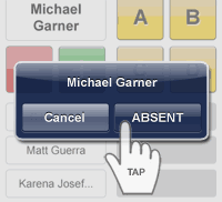
Another option is to press on the name of an absent student when the student appears in the top box. An Absent dialog box will enable you mark the student absent.
The downside was that you had to remember to remove the Ab indicator. (Tap the student's name in Edit and then tap the Present button.) If you neglected to do this, the previously absent student would not appear in the Class Queue when you were calling upon students the next day.
The updated version of the app will automatically clear every Ab at the beginning of the new day. Just one less thing for you to have to worry about.
BTW: It actually occurs at midnight when the date rolls over, but you probably won't be awake to see it happen.
#4 Return From Hold Indicator
The Hold Queue--the gray boxes below the yellow letter-grade buttons--is for students who ask for more time to develop a response. Not only does this reduce the amount of pressure some students experience at responding, it also sends a message that thoughtful responses are both appreciated and worth the wait. When a student in the Hold Queue is ready, he knows to raise a hand. A tap on his name will return him to the top box.
The other way a student in the Hold Queue is returned to the top box occurs automatically. That happens when all four gray boxes contain the names of students AND another student is sent to Hold. When that occurs, the student at the top of the Hold Queue--the one who's been there the longest--is returned to the top box.
The box, normally white, turns gray to provide a bit of feedback about the fact that the student you're about to call upon is being forced out of the Hold Queue.
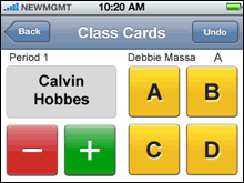
I thought it made sense to have that happen--the gray box, that is--every time a student returns from Hold.
#5 Simplified Exporting
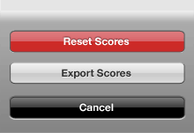
There was a bit of confusion regarding the difference between Export Scores and Archive Scores. So, to simplify things, Archive Scores has been removed.
#6 Server Update
The update to the server will allow you to delete classes you no longer need. This will help to make the on-line display of classes more manageable.

Note: Deleting a class from the server will not delete it from the app. You still have to do that yourself.
Bonus
If you are so inclined, you'll be able to:
- Print out a score sheet from the server.
- Delete the class from the server.
- Reset the scores for that class on the app.
The next time you export scores, you'll see the class in your list of classes again but with a new Start Date.
The idea here is to encourage teachers to provide students with a fresh start every three to four weeks. That's because it takes some students a number of weeks before they finally realize that you're serious about everyone participating in lessons and discussions.
Unfortunately, though, a number of them will be saddled with the low scores they had received in the early stages of Class Cards use. A fresh start will lift eveyone's spirit.
And by retaining the print-outs, you'll end up with a complete record of how your students responded during the course of a quarter or semester.
![]()
